KADAM
Typeface Design
PROJECT PARTNER: Sanjana Vamadevan
PROJECT GUIDE: Tarun Deep Girdher
at National Institute of Design, Ahmedabad.
2019
Kadam is a devanagari display typeface with a family of 4 fonts that range from regular to reverse contrast. Two weights were manually constructed, while the other two were created using interpolation.
Compared to Latin, there are very few Devanagari typefaces available for use. We also often see devanagari typefaces based on their Latin counterparts, and hence we chose to design one from scratch with its own characteristics. Kadam’s monolinear, low contrast and high contrast weights provide an experimental and fresh visual style. Along with varying contrast, it is also defined by its wide letterforms, knots, large counters, vertical terminals and thin stems.
We also invited our fellow designers Sharan Adka and Videet Desai to create specimens along with us to explore everything the typeface could offer.
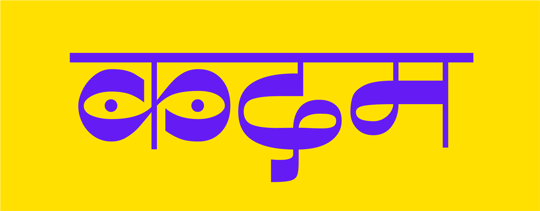


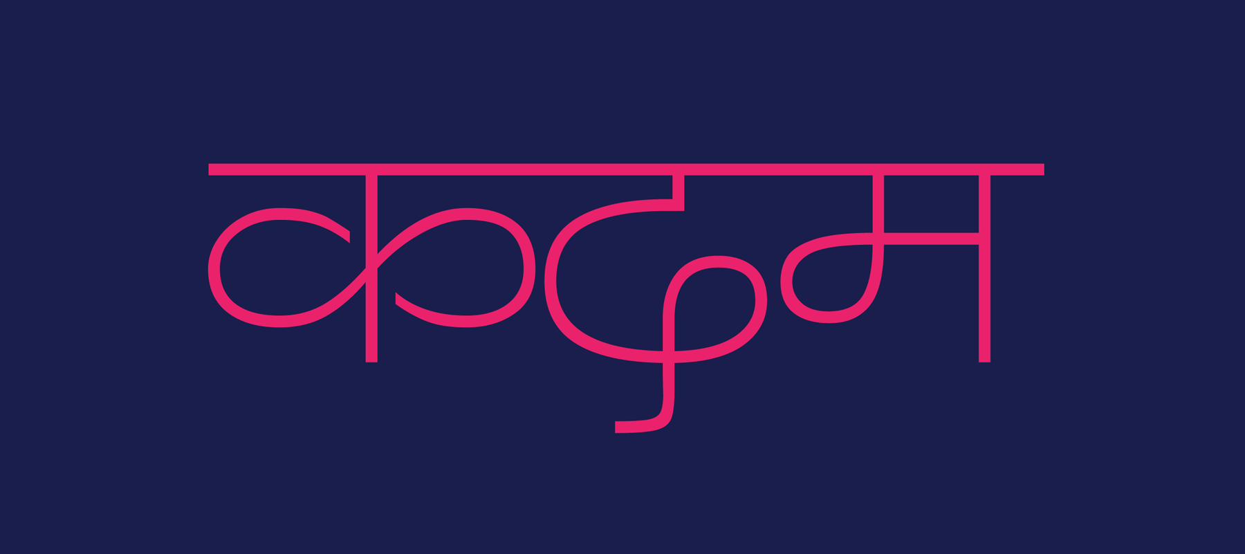

The 4 weights of the typeface - ranging from Monolinear to Reverse Contrast

The Monolinear weight set in sample body text


The typeface used for concept matchbox designs

