NETPROPHETS CYBERWORKS
Brand Identity
2020
NetProphets Cyberworks is a software solutions and service consulting company. Their work focusses on data warehousing, data intelligence and custom applications. They also call themselves 'tech architects' as their strength lies in finding the problems for their clients and building personalised solutions.
Noticing a slump in spirits, they were looking to change their twenty-year-old logo and branding system in an attempt to appear more fresh and forward thinking and as a result, attract clients of the same kind.

THE FOUNDATION
NetProphets provides functional design, coming from a strategy-oriented approach. They are reliable and trustworthy in their partnerships and services.
THE VISION
NetProphets aims to come across as more modern and fresh. They wish to take what they have already built into a re-imagined future, showing their willingness to grow and adapt.

THE PHILOSOPHY
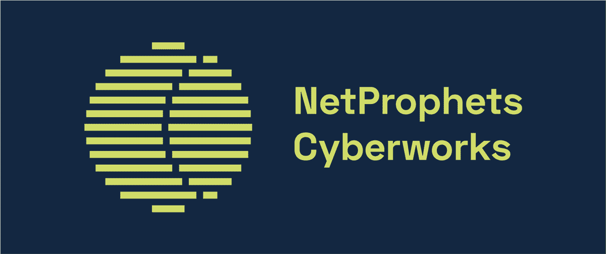
The Eye and its Shadow convey foresight and shows that NP looks to the future.
The individual lines make up the whole circle in the same way that they employ a strategy-oriented approach to deliver holistic solutions. It also symbolises how the whole is made up of many strong partnerships.
The overall look is one of modernity, clarity, and reliability.

Alternate lock-up

Brand typefaces

Colour palette to be used across all media and collaterals
A Brand Book was made, outlining all the guidelines to be followed while using the elements of this brand system.


Presentation slides

Business card

Small and Large Envelopes
