TUNE
Data Visualisation
PROJECT TEAM: Manasa Krishnan, Sanjana Vamadevan, Sharan Adka and Videet Desai
PROJECT GUIDE: Dr. Jignesh Khakar and Prachi Nagpal
at the National Institute of Design, Ahmedabad.
2019
Tune is a project that attempts to plot the dynamic between music and its listeners. The National Institute of Design brings together students from different parts of the country who have diverse cultural backgrounds. Hence becoming a cauldron of varied music preferences under one roof.
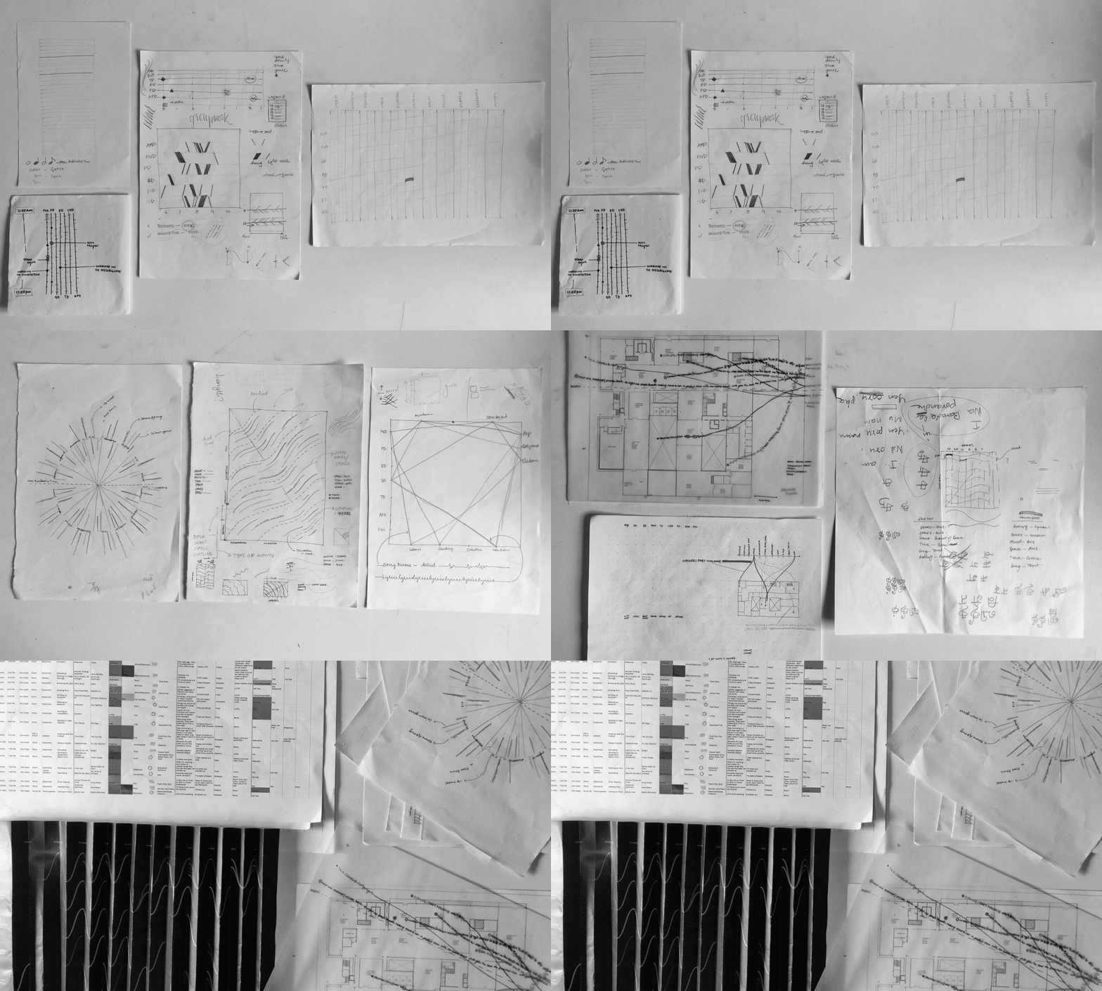
Over the course of a week, this project involved collecting data, exploring suitable visual representations and finally creating a mapping that represented the correlation between the parameters, giving rise to new connections. Two interactive visualisations - each with its own purpose - were created as a result of documenting the songs and genres people listened to, their moods, the space they were in and their activities at that time.

95 Respondents - Data was collected over three days from a multitude of people around the campus who were spotted listening to music.
INQUIRY 1
Does space, time, mood and activity affect our music choices?
INQUIRY 2
What does NID listen to?

We looked at the interview questions through the lens of visual queries—what is the story?

Explorations of visual representations went through a series of discussions
THE 4 AXIS GRAPH
This visualisation addresses the first inquiry. To see connections between the parameters - space, time, mood and activity - we created a four-point plot graph with colours to match genres. Each quadrilateral represents a single respondent and their data. Preference over music or lyrics has been encoded in the line itself with the song lyrics written in the case of the latter.
This interactive chart is a method to isolate parameters to notice behaviours to infer a larger trend.


Details of the graph
THE ACCORDION GRAPH
This visualisation addresses the second inquiry. It looks at a simpler representation with fewer number of parameters.
Moods were marked on the x axis while spaces were marked on the y axis. Colour denoted the genres of the songs. Time was divided into two halfs—day (6am—6pm) and night (6pm—6am). Though this was plotted visually with the use of the upper or lower waves, we used the audience's viewpoint as another parameter. By creating an accordion fold, one can see all the morning songs from one position and the evening songs from another.

Details of the graph
A visualisation of the different views


